Our client 180 Training offer flexible learning solutions for young adults. They offer a range of high quality training courses and qualifications for adults looking to change direction and retrain. With a wealth of fully accredited courses with start dates throughout the year, their courses are flexible and professional.
We were approached by The PTM Group in 2015 to help design the website for a brand new re-training service for 18–25 year olds. We knew that we needed to combine the importance of learning with a fun, edgy brand that would appeal to the target market. The design also needed to consider the needs of potential employers looking to form partnerships.
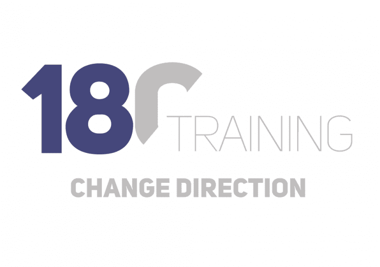
The logo was designed to evoke the suggestion of a ‘turning point’, or doing a 180° turn. The ‘0’ in 180 is sliced in half to suggest that by taking up re-training opportunities, their students can change their career trajectory and shift into new directions. Their slogan ‘Change Direction’ continues this visual symbolism. Our logo design was also used on a range of apparel specific for members of staff at 180 Training.

We designed the website with a broad colour palette in mind: a muted purple and a warm, golden-sunlight yellow amidst blues, burgundy and greens. On larger screens, the website content centers in the middle of the page, with a limit of the width of the content. We designed the website to respond to screen-size, adapting to smaller screens by filling out the entirety of the available width, whilst shrinking down each element to accommodate the smaller screen.
180 Training is a fresh and innovative approach to retraining in the North East of England. We were so thrilled to work with them and look forward to seeing them grow throughout the coming years.


