When a visitor lands on your website, you have a brief window of time to grab their attention. If you don’t take full advantage of this window, you may lose a potential customer or sale.
On the Sleeky blog this week, we take a look at 7 great websites with the ‘wow’-factor, in particular, bands and musicians.
Most musician’s websites will have things in common. They will often include prominent photos of the artist or band. They will more than likely feature a biography, tour dates, a direct-to-fan shop to buy or download music and possibly a blog or news section.
Most band websites make use of large photography or full-screen backgrounds. There is often a strong emphasis on colour and visuals which tie in with their latest product release or live tour. Yet, some bands choose to be more subtle and clean in their visual style.
Below we have compiled some examples of 7 musician’s websites. These sites all use especially effective methods to grab their audiences attention.
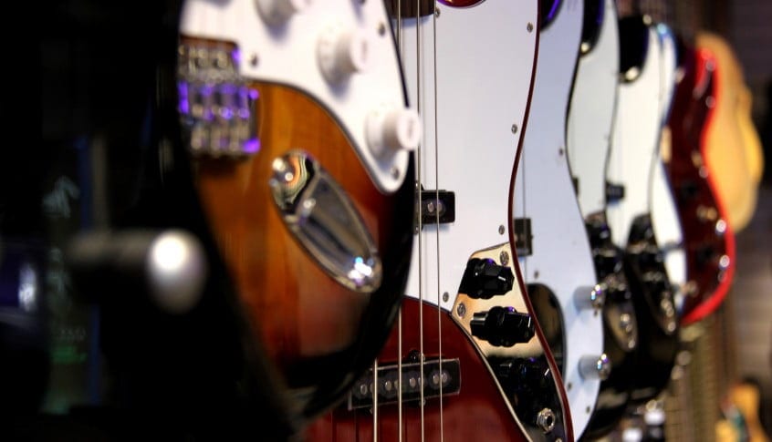
Photo Credit: Samantha Beddoes (Creative Commons)
Soundgarden
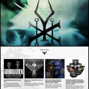
The Soundgarden site is often referred to more as a piece of art than an official website. The website designed by Creative Corporation took over a year to make and collects the complete visual and audible history of the band. The site offers large visuals and links to music videos alongside a ‘fan feed’ which collates the memories of fans taken from social media. A direct-to-fan shop is included for online sales of music and merchandise.
Beirut

The official website for Beirut takes things back-to-basics with a pared-back approach. This responsive site has a lush blue background with a heavy-focus on embedded content: YouTube videos, magazine articles and reviews of their album releases. On smaller screens, the content stacks incredibly well and loses no content. The website features clear navigation options, making it simple for fans to subscribe to their mailing list or social media pages.
Madeon

French DJ and musician Madeon’s interactive website makes use of HTML5 and Javascript to provide a vivid-experience to the viewer. There is a heavy emphasis on animation with links and buttons moving and popping as you mouse-over them or press them with your finger. The site shines on mobile as your fingers navigate and slide through the website. Not only is the website informative, but it also includes Madeon’s ‘Adventure Machine’. This is an interactive game allowing fans to string together samples and sounds from his music to create and share their own ‘remix’ of his work.
Chvrches
Scottish-electronic indie group Chvrches have placed a heavy emphasis on their product artwork with their website. The site places beautiful imagery from their latest album release ‘Every Open Eye’ front and center. The group make use of the Spanish .es domain extension to keep their domain-name short and quicky (https://chvrch.es). Large, bold buttons are scattered across the page which lead to different sections. When pressed, each button brings up a pop-over modal window which includes interactive content such as music videos, tour dates and a fan-club. The website is fully responsive and scales down gracefully to smaller devices.
Nils Frahm
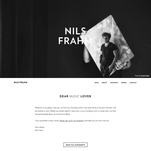
Modern-day neo-classical musician, composer and artist Nils Frahm keeps things simple with his stark monotone website. There is a heavy emphasis placed on large photographs and clear, distraction-free bodies of text. Like Frahm’s music, his website places importance on the space between the elements involved. His website is clean and crisp with emphasis on responsive design: elements stack into place without fault.
Jungle

The official website for British modern soul collective Jungle keeps things simple with a ‘slide-show’ of features. The site takes a few moments to load but when ready, presents a series of 5 full-screen slides. Each slide relates to a different music video and includes a link to watch and to buy their album. Jungle’s website is a poignant example of using external elements (in this case, their well-produced music videos) to keep things visual for your audience.
Courtney Barnett

Australian singer-songwriter Courtney Barnett’s website is slightly different from the rest. A large embedded live performance video takes the place of a Hero graphic above the fold. An algorithm continuously loads new content as the user scrolls down the page. New content is both loaded from a pre-selected range of sales links and external content, or is sourced from social media feeds. Fan photos and comments intersperse alongside official recommendations from the band. This fan-oriented ‘ticker’ approach works well because their fans are passionate enough to regularly publicly comment about the band, and this comes across to the reader.
We hope that you have taken something interesting from the websites highlighted above. As the devices in our pockets and on our desks become more powerful, the available processing power and memory we can utilise increases. This allows us to do so much more with what internet users see in their browsers and on their devices.
There is a common thread which runs through all these websites. We always consider in the sites that we make for our clients.
– Keep navigation simple.
– Don’t overcomplicate the design.
– Be unique, don’t use templates.
– Crisp visuals for higher-resolution displays.
– Include social media integration where appropriate.
Get a rockstar website of your own by speaking to Sleeky today. Take a look at our web design packages, starting from £395.


