Rebranding an identity can be a revitalising experience for a company. Stagnating sales, falling market shares or a plain old lack of public interest can be reversed with a reappraisal of the brand’s position in the market, what it is they offer and how they deliver it, alongside a visual overhaul of brand assets.
Anyone can change a font, pick some new colours or cobble some clipart together. But identity design is a lot more and when done by a professional and integrated with a company-wide branding effort can reverse the fortunes of even the most underperforming of firms. Colours are chosen on a psychological basis, with every tone of every hue having a different influence on human behaviour. Fonts indicate the tone of voice a brand is talking to it’s customers in. Symbols connect the senses with characteristics, and create emotional triggers and memories. A well planned and perfectly executed brand identity can be the difference between success and falling by the wayside.
But even the best identity designers in the world get it wrong. Here we’ll look at some of the best, worst and downright baffling rebrands of all time.
The Good
Netflix

Netflix transitioned from DVD rentals onto the streaming movie scene in 2007 and have become the most famous name in the industry, with a global userbase of 81 million subscribers. In 2015 they subtly rolled out a redesign of their famouse arched logo. Gone were the boxy shadows and the white on red colour scheme, replaced by a stunningly modern flat red on white design. Netflix’s entire online and offline presence were brought into step with each other, creating a highly cohesive brand identity and bringing their tired looking identity bang up to date – an important image for a technology based brand.
Air BnB

Providing property owners with an easy to use global platform to rent out their spare rooms and homes, Air BnB launched in 2008 and has over 1.5 million active listings on it’s website. In 2014 they decided to redesign their identity to reflect the growth of their pioneering service. A clever, clean and unique symbol (called “The Bélo”) was crafted, the designers combining people, places, love and airbnb into a memorable and easy to sketch logoform. The symbol has already begun to infiltrate the collective conscience and is the most memorable of the quirky icons we’ve seen in recent years. When the new identity was launched Airbnb trended at number 1 on Twitter for a massive eight hours!
Pizza Hut

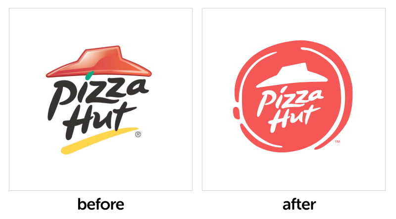
When you’ve been selling pizza for over 65 years, you learn to keep your brand fresh. Keeping iconic elements like the ‘roof’ icon and the now famous typography, this new effort for Pizza Hut looks to the future whilst keeping an eye on it’s heritage. A dollop of tomato sauce – that just happens to look like a pizza base – now encases the famous elements in a flat, modern red style. The branding is worked beautifully across the entire identity of the firm – boxes, menus, websites, restaurants – a massive undertaking that took over a year of work to pull off. The results are promising – the shift in style not only visually but across the menu and ingredients has resulting in improved sales for the first time in years.
The Bad
Gap

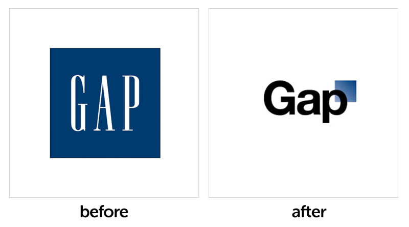
The Gap performed probably the quickest about-turn in rebranding history when they abandoned their bizarre new identity after just four days following public outcry online. It’s easy to see why – the new logo shows a complete lack of appreciaton of why the original logo worked so well.
Cardiff City

Cardiff City are known for their blue kits, which they’ve worn for over 110 years. But when they were bought out by Malaysian investor Vincent Tan in 2010 he decided to change the club colours to red in order to increase the club’s appeal within the Asian market. Needless to sat this didn’t go down well amongst fans of The BLUEBIRDS and the colours reverted halfway through the 2014-15 season.
Wonga

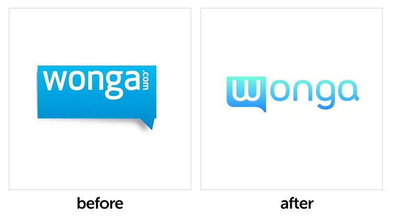
In what ranks as one of the stupidest design scheduling decisions ever, trumped-up loan shark scumbags Wonga changed their already hideous logo into something much worse. What makes it worse is they changed their logo just days after the release of a Newcastle United kit that was emblazoned with the old logo, meaning they’re paying for 12 months of advertising of an obsolete brand. Serves them right.
The Ugly
London 2012

Not strictly speaking a rebrand, but an iteration of the Olympics logo for the 2012 games, the logo was met with ridicule and rightly so. It makes no sense to anyone, is visually repugnant and hopefully will never be seen again after the publication of this blog.


