We get a variety of clients through the doors here at Sleeky Towers. Some are just starting up – they come to us with a blank slate and we’ll work with them on a new brand identity as well as their website. This allows us a chance to develop the brand basics – logos and straplines – alongside other reusable brand elements made for the site. Others have an established brand, but are looking to coincide a refreshed identity with the launch of a new website – in which case it’s less of a blank canvas, more an interesting challenge. Other companies have well-proven brands which they have no intention of changing – and why should they if it’s brought them sustained success for many years? One such client of ours recently was J3 Building Solutions, one of the most well respected commercial builders Newcastle has to offer with just under 30 years of experience under their belts.
The Starting Point
![]()
The existing logo contains elements special to the business owner – the 3 Js in the name referring to close family members, also represented by the three squares. The colour scheme had become synonymous with the business – the blue vans often to be found near a large scale building job around Newcastle.
Adapting Typography
The main typeface used in the logo is a bold variation on the Eurostile font. Whilst certainly having it’s uses, and being an excellent choice for a logo font, there were two reasons we decided to use a different font for the website content. Firstly, our Eurostile licence doesn’t cover it for web use, and with font licences adding substantially to website costs, many customers consider using some of the excellent free web fonts from fontsquirrel.com. Secondly, using Eurostile as a body font just isn’t a good idea – it’s meant for display use, and doesn’t read well in large blocks. It’d be fine for headers, but we were creating a brand new, responsive website utilising a flat colour scheme based on the Material pallette, and felt it would look dated if used heavily.

We knew we wanted a sans serif font that had a strong bold variant for the large page headers and captions, and League Spartan seemed the perfect choice. For the body text we opted for Gandhi, which looks clean and modern, and complements the stronger weight of the headings whilst retaining an impressive readability.
Flourishing
To retain the feel of the brand across the site, we utilised the blue and red from the logo for all headers and main points; we used bold iconography in red with blue rollovers; and we repurposed the three J squares as an additional flourish for the titles.

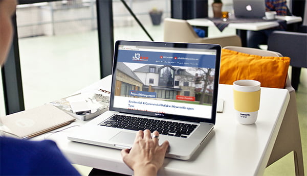
Finished Product
The finished website has taken a 29 year old brand, and – without changing a pixel of the design – built around it a perfectly clean website that is refreshing to the eyes, easy to use and bang-up-to-date. The responsive design enables a fantastic fluid view on mobiles and tablets, but the biggest victory is that through thoughtful planning and a highly considered design process, we’ve ensured that the customer’s brand really is the star of the show.